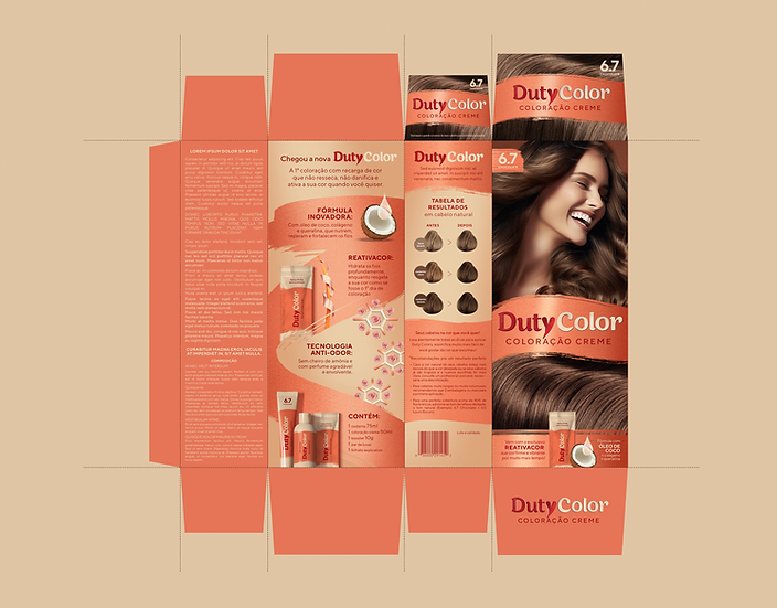
The Duty Cosméticos branding project had a clear objective of establishing a strong presence in the beauty industry, specifically through the launch of their flagship brand, Duty Color. This brand directly competes with the leading at-home hair dye brand in Brazil, a market recognized as one of the largest globally for cosmetics and hair products.
Key components of the project included the development of logos for both Duty Cosméticos and Duty Color, utilizing a delicate and easily recognizable lettering style. The logo showcases a notable heart shaped red letter Y, thoughtfully crafted from two smudges, symbolizing both the materiality of the products and the brand's distinct feminine personality. Furthermore, the project involved the selection of suitable typefaces for effective communication and the creation of a feminine and elegant color palette. This color palette encompassed a range of shades, from skin tones to a vibrant red and coral, with subtle metallic accents. The packaging design for the complete hair dying kit played an integral role in ensuring a cohesive and visually appealing brand experience.
DUTY


.jpg)


